When I accepted the project of painting the wonderful tourist spots of Paris, I know I was in for an exciting treat of making my client’s memorable places come alive and feeling like I am one step closer to my dream destination. But I am also aware of how challenging this endeavor will be but that didn’t stop me from saying yes.
My client mentioned her special places in Paris– Eiffel Tower, Sacre Coeur, Notre Dame, Arc de Triomphe and the River Seine. She wanted three separate paintings but in essence when they are combined it will look as one. I gathered some photos of the architectures for reference then I start with a mock up using watercolor. In reality though I didn’t follow the same color scheme of this draft.
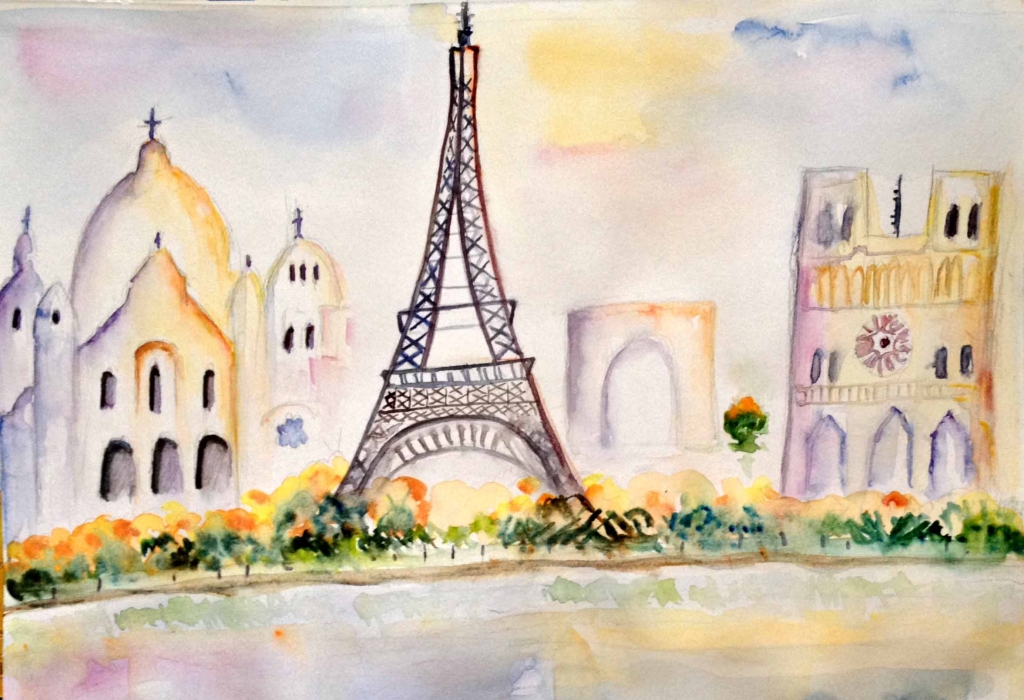
The Sights of Paris Mock up
After it was approved, I prepared three sheets of 12″ W x 16″ H watercolor paper and laid down the margins on all sides and draw a line for the River Seine using a HB pencil and ruler. I feel like an architect drafting these structures and measuring everything to achieve balance. This process is a tough one and many patience is needed in order to get it right.


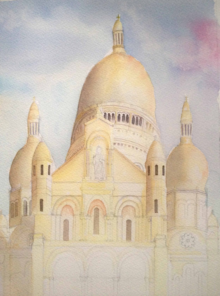
A second round of approval and I am on my way to start painting. I created a diluted wash of Cobalt Blue and Phtalo Blue with touches of Yellow Ochre and Permanent Rose for the skies. However, I made a mess with the sky of the Eiffel Tower that I had no choice but to redo everything though thankfully with the aid of tracing paper which made my life a bit easier. For the landmarks I always start with an under painting and I prefer golden colors of mixed Yellow Ochre and Light Yellow with lots of water to set a light tone. Then I layer a mix of Yellow Ochre and Burnt Sienna wash for the darker tone. I continue to build on layers using the first two washes as needed.


Most of the shadows are done by mixing Cobalt Blue with Red while for the dark areas Cobalt Blue plus Burnt Sienna are used. I added foliage around the edges of the buildings. I find that Yellow and Cobalt Blue makes quite good green while Phtalo Blue and Burnt Sienna creates nature-like dark green. Loading my brush with both colors and allowing them to mix on paper makes painting exciting. Negative painting is also a great way to bring out some of the branches. For the River Seine, I applied wet on wet of colors that I have been using and allowing those to blend.
The Sights of Paris– finished paintings.
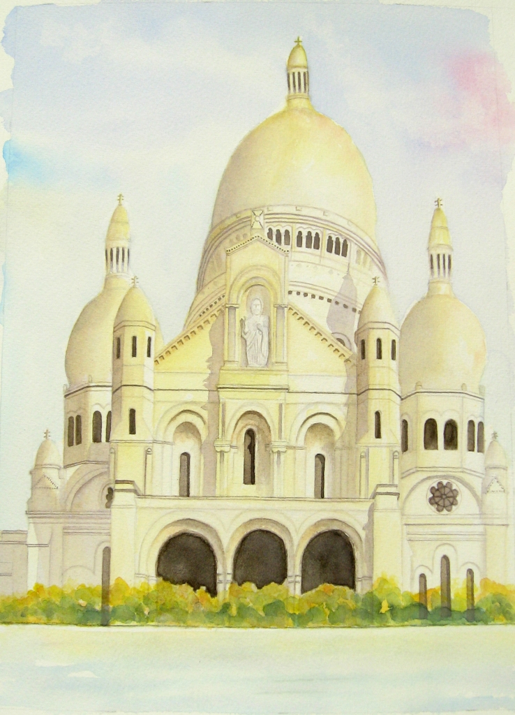
Sacre Coeur
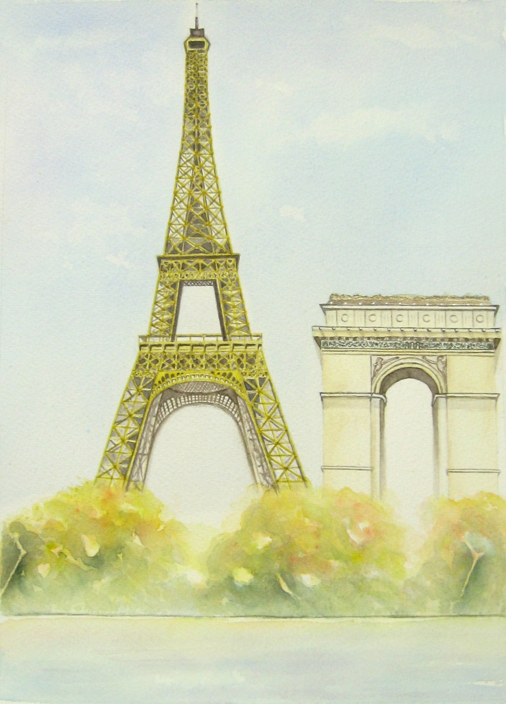
Eiffel Tower and Arc De Triomphe
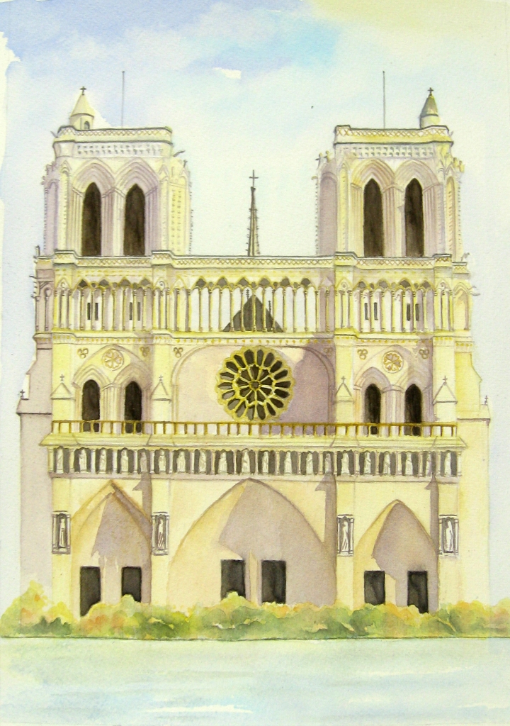
Notre Dame
What I learned is to always work light and slowly build up darker colors as I go. I need to be patient as I wait for the painting to come along and unveil its beauty at the right time. I wanted my paintings to contain a kind of looseness element in it despite the details by removing some specifics like statues and bricks etc and by using vivid colors. I created a color chart, put the paintings on a distance to see how it looks from afar, sometimes I walk away and rest to ponder on the progress and so forth. It took me a couple of months before I can truly say that I am done. Painting is a journey.
I am thankful to God for the open door and it is His grace that empowers me to accomplish things for Him. This work humbles me and the end goal of everything that I do is that God be glorified and honored and praised. Thank you Jesus.
A free ebook that helps you create expressive sketches of your life in pen and watercolor.
Leave a Reply