Emma, Pride and Prejudice and Persuasion— the client’s favourite Jane Austen novels accompanied by the stories’ wonderful locations. I haven’t read the timeless novels yet but this project makes me want to flip through one right away.
As always I began any work with a draft sketch and painting. Though this project meant to have 3 separate paintings I have put them all together.

Jane Austen Project Draft
Below are the initial pencil drawings. I particularly had a challenging time with Pemberley (last photo) because my left brain sort of forgot how to measure. Nevertheless, the grace of God has been my help and He gave people to support me and His patience helped me finish it.
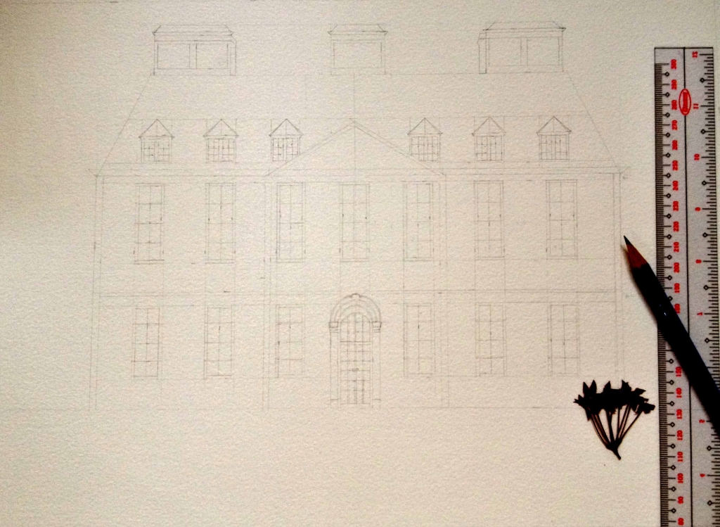


Pencil drawings
Setting the correct value in the initial stage of the painting is crucial. And that is why I often start with an underpainting of a watercolor wash to help serve as a guide. I darken the areas where the shadows are (more paint) and lighten the parts where the light is (more water).

Pemberley (work in progress)
Hartfield has been a delight to paint mainly because of its bold red color that gives a hint of energy. There were more than 5 coats of red in this structure and with each application I added more cobalt blue and lightened it as I move towards the light. I did the dry brush technique for the roof and use that to also add texture for the chimneys. This painting is an ideal example of what it looks like to pair complementary colors. The two indeed made each other appear brighter.

Hartfield (Emma)
Royal Bath Crescent is an unusual structure. It looks a bit longer in the actual but the paper wasn’t long enough to accommodate the length of it. I painted this last and allowed myself to go loose with it. I really like the contrast of the light and dark and would like to thank my client for telling me to add more darks. The windows and the left corner of the building is painted without much detail leaving just the white of the paper which I think makes this painting sparkle. I like how the huge grassy field brings a nice contrast against the details of the architecture.

Royal Bath Crescent (Persuasion)
Out of the three architectures, Pemberley has been the most challenging building to work on. Not only was the measurement part tricky but also painting in between the windows cause the brush to move along quite stiffly. Nevertheless, what I think brings the painting to life are the windows. It reflects the fragments of sky and nature making this painting sing.

Pemberley (Pride and Prejudice)
It has been a delightful journey to paint the special places where people have traveled. Hearing that they cannot wait to hang the pieces on their walls gave me encouragement. On account of all that I do I want to give God all the glory and honor because He deserves it. For apart from Him I can do nothing (John 15:5).
A free ebook that helps you create expressive sketches of your life in pen and watercolor.
2 Responses
Jennifer Kennedy
I’m in LOVE with your paintings!! I want to be like you when I grow up. Ha.
I love the Royal Bath Crescent. I remember seeing this impressive building when I went to Bath a few years ago.
You’ve inspired me to try my hand at painting buildings! I’ve tended to shy away from that. But, these are absolutely beautiful.
Elisa Choi
Thank you so much Jennifer! Wow you have been to Bath and I think seeing the real thing is even nicer! Thankful that this inspires you to paint buildings. Please show me your finished painting when you’re done. Thank you for dropping by.. have a blessed day! :)